|
RCT2 Hotels
an RCTspace Tutorial Team tutorial.
written and produced by marinersfan59
Billerica Bay (xophe) | Porto Cristo
(x250) | un-named (marinersfan59) | Weather
Wonders (xophe)
Klamath Lake (RCTNorthWest) | Pacific
Island (RCTNorthWest) | UHH Hotel (rwadams)
Sherwood Heights (rwadams) | Winston
Ritz-Carlton (rwadams) | The Hilton (rwadams)
The Bellagio Hotel & Casino (Emergo)
| Turistica (Emergo)
Billerica Bay Hotel, by Xophe (VP Winner: June
2004) (Back to top)
Click here to download Billerica
Bay by Xophe, member of RCT:Fusion

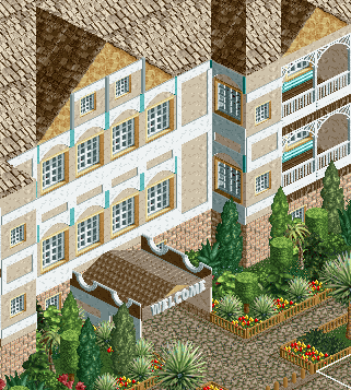
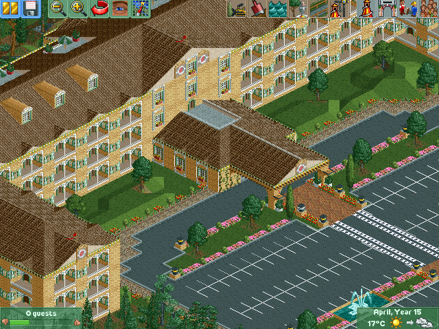
Entrance to the Billerica Bay Hotel.
Notice his use of plants around the pathway and covered entry, how they are
in an orderly fashion. Most hotels don't just randomly place plants, they're
in a pattern, which draws attention to the area.

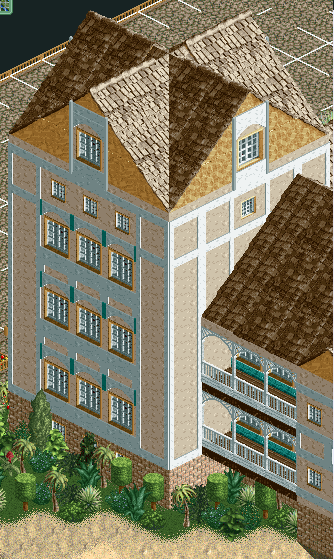
The back side to the hotel.
In this screen, the hotel balconies have a great view of the beach and the water
around them. In this particular hotel, the balconies are set within the walls
(contrasting porto cristo). Xophe does a nice job here
in varying his rooves, which takes away from the normal "repetativeness"
of most hotels. He also make good use of the layering technique by placing the
white accent walls over the windows, which helps tone down the blocky appearance
of most hotels.

Corner Tower & hotel suite
This picture shows more of the layering and ability to change the building's
entire appearance with just using the extra layer that most neglect to take
advantage of. Also look at the balconies closer in this view in order to see
a very popular format, using the western walls and Victorian arches. I'm not
saying to copy this balcony type, but it should give you ideas.
Porto Cristo, by X250 (Back to top)
Click
Here to download Leviticus/Porto Cristo Resort by X250, member of RCT:Fusion

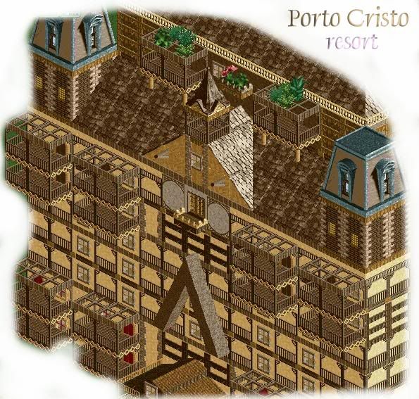
Front facade, upper levels.
X250 does a great job here of layering, but uses it in a different way, to
give a different feel to the building. He uses his brown colors, mud walls,
fences, and great red doors to give this hotel a Spanish/SouthWestern feel.
It's also very noticeable that his balconies come outside the walls of the hotel.
This is the 2nd type of balcony, and can also be very visually appealing if
done right. A major thing that this type of balcony usually could use is angled
base blocks and arches on the bottom. They add a great more modern look to the
building, but are also not for all hotels to use. X's hotel works better without
them because of the style of the building itself.
You can also see his style of roofing, and how he includes the two towers with
a point in the middle. This is very visually appealing, but needs to be done
with special care to detailing if it's to be done right. He did a great job
of making these towers too.

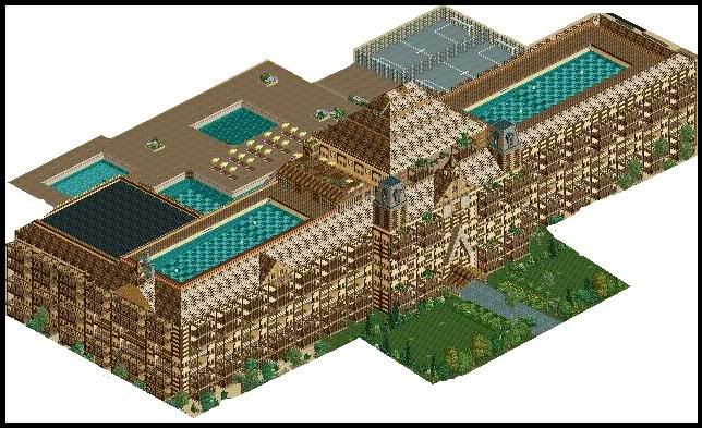
Overview of the resort
I'm posting this image to show the massive size of some of these hotels. They
are, by nature, very large buildings that need detail to be kept up throughout
the whole project.
Another key feature in this hotel that I'm showing is the pools. Almost every
luxury hotel that you see will have a pool in it. They can vary in sizes and
shapes, but pretty much every hotel should have a pool included. I've even seen
some with all-out waterparks.
Un-named, by marinersfan59 (Back to
top)
Download Unavailable at this time

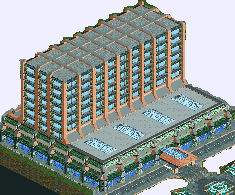
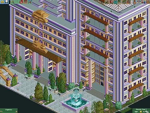
Overview of the hotel.
Click
image to enlarge
In this screen, I tried to stay away from the ordinary shape of a hotel by
making the balconies in a new way. On the bottom, they balconies are built in
to the hotel, while on the upper floors, they are actually both inside and outside
the structure. The pilars going up the sides add two effects; they give the
appearance of a very structurally strong building, and they take away from blocky-ness.
The plants on the balconies break up the colors and give each balcony a little
bit of comfort. You can see below how I made the lower balconies more in-depth
and used various scenery to make it look good.

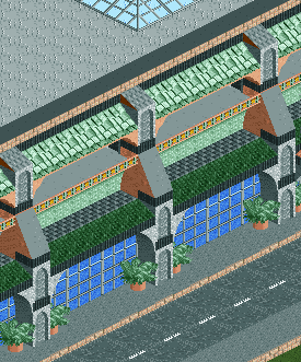
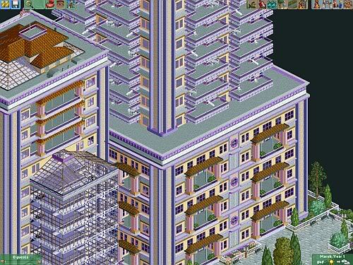
zoomed view of lower levels
It's important to know that in almost every luxury hotel, there are no actual
hotel rooms on the first level. There are, however, conference rooms, offices,
and other features that can be unique to each hotel. On the lower levels, you're
free to do whatever you want to make a good design. I chose to follow a major
structural idea (narrow the building as you go up) to make the first, which
happens to be the tallest, floor. I also blended this idea with the first level
of hotel rooms.
Also shown are some planters. As said before, it's important to have a very
well organized landscaping plan around the base of the hotel, and to block off
as little as possible. Since this particular hotel was in front of a sidewalk,
and had no room to do this, I put planters in the corners to break up the sharp
corner feeling, which shows blockyness.

Entrance to hotel
Click
image to enlarge
Every hotel should have a nice entrance and drop-off point. The guests need
somewhere for their luggage to be brought in, without having to carry/wheel
it across a parking lot. This also makes for a great place to make a hotel in
your own style. I, for example, chose to make a fountain and waterfalls to welcome
my guests into my hotel. It looks much better when you do this, and can make
the environment that the hotel is in much better. Also another (optional, but
good looking) option would be to add a parking lot, as seen in xophe's Billerica
Bay and Weather Wonders. I will be adding one in for this
hotel too, but haven't gotten around to it yet.
Weather Wonders Hotel, by Xophe (Back
to top)
Download Unavailable at this time

Overview of hotel
Xophe follows up his great hotel in Billerica Bay with creating another magnificent
one in Weather Wonders. He covers all of the other principles set forth on this
page with extreme precision. The roof of this is an excellent example of how
ToonTowner's Spanish rooves can be used, and he uses quarter blocks and overlay
windows very well with the windows on the roof. Not much landscaping was done
in the front of this hotel at the time of this screen, but it still is an amazing
hotel with another very clean appearance.
Klamath Lake Resort, by RCTNorthWest (NewElement Runner
Up) (Back to top)
Click here
to download Klamath Lake, by RCT:Masters

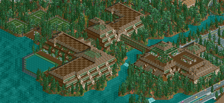
Overview of the hotel
Click
image to enlarge
In this overview, it's pretty obvious that RCTNW is making his resort differ
from normal rectangle shaped hotel buildings. He uses a very spread out approach,
in combination with a short building of only 3 floors. This way he's not blocking
out any views of any other scenery or rides around it, including the nice woodie
that passes by in the background.

Parking lot and entrance
In this screen, you can see a good view of the greenhouse on top of the main
building of the hotel. This is a good example of how tinted glass can add a
nice effect to the theme of a hote, shown by the bridges, the restaurant, and
the greenhouse. He also makes a very nice and neatly organized (while keeping
the woodland theme) parking lot in front of the hotel for the guests to park
their cars. This hotel also includes a feature popularized by Disney, a monorail
station inside the hotel. This adds to the uniqueness of this particular hotel,
a feature that every hotel should strive to have.

Balconies and roofing
Click
image to enlarge
In this screen, the thatched roofing is shown closely, which is a very good
method to make a large flat roof look interesting. The balconies also have a
design that RCTNW loves to use, the extruded balcony system. Every floor's balcony
is brought out one more tile than the one above it, giving it a strong structural
design and a very mind-pleasing look. He also uses the awnings above half of
the balcony to give each one more depth and to take away from the fact that
the walls aren't layered.
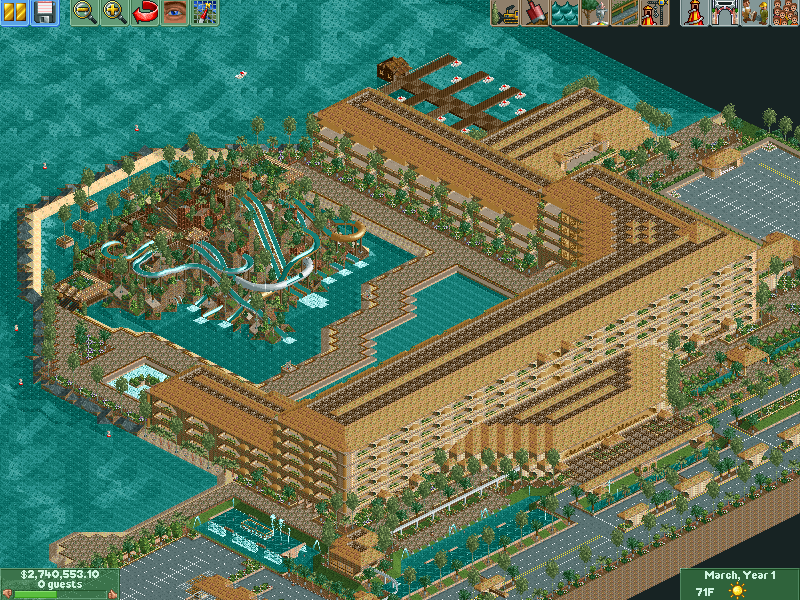
Pacific Island Resort, by RCTNorthWest (VP Winner:
April 2004) (Back to top)
Click Here to download
Pacific Island resort, by RCT:Masters

Overview of the hotel
Click
image to enlarge
As seen in the overview screenshot, the hotel takes a U-shaped design, and
RCTNW uses water to his advantage very well. The hotel has many features, including
a waterpark, a multi-level parking garage, a near-by main road, fountains, ponds,
and even docks. The options of add-ons to hotels are endless, which is very
well shown by RCTNorthWest here.

Entrance to hotel
RCTNW shows off an interstingly shaped and very large entrance area in this
screen. This provides cover for those getting dropped off at the hotel, and
this area also houses a monorail station on the upper floor. He uses good landscaping
(especially for the scenery available) to add more color to the building, and
the trees to add more color to the upper floors.

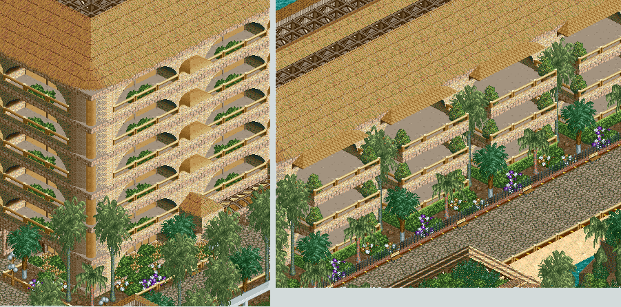
Balconies close up
Click
image to enlarge
In this screen two different types of balconies are shown. While similar in
design, one type stays inside the building, while the others are brought outside.
This gives the building more to look at, as the style changes partway through.
I'd also like to point out thta the face of the building isn't completely flat
when the balcnies are set within the walls. The 1/4 blocks, in combination with
the brick wall and wooden fences give the appearance of more depth to each section.
As he gets to the corner, RCTNW doesn't just settle for a pointy corner. He
makes the walls curve, and added a pole to avoid a blocky looking edge.

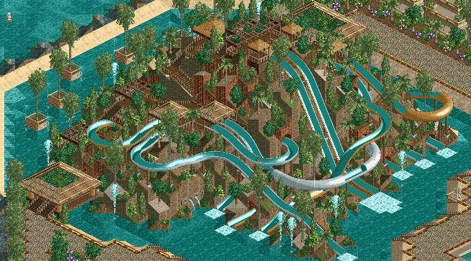
Waterpark
Here's an idea that is rare to find in hotels, or even parks. Here, RCTNW makes
a great-looking waterpark situated on a large mountain, while using minimal
scenery items. He forms the land perfectly, and uses the waterslides to give
the mountain a better appearance. His use of water features, like the fountains
and water spouts, around the area give it more of a waterpark feel. He also
uses the whitewater at the base of each waterslide to make it look more realistic.
He's done a great job of making this island look like a good waterpark to go
along with a hotel.
Universal Hollywood Hills, by rwadams (Back
to top)
Download unavailable at this time

Overview
Look at the size of this hotel. It's monstrous and it keeps it's great detail
and design without becoming repetative. One of the techniques to combat repetativeness
is his use of the extruding balconies. Although they are still vertical, it
gives the illusion of angled building, making it look different. This screenshot
also shows all the different colors that he used to make this hotel visually
appealing.

Zoomed in view
One thing that I really like about this screen is how it uses the foliage to
hide blank walls, and break up the white that he used so much in this hotel.
His use of red and yellow lines around the glass windows also make the hotel
look more attractive, and it gives this hotel it's style.
Sherwood Heights, by rwadams (RCT Olympics gold medal
winner) (Back to top)
Download unavailable at this time

Overview
rwadams' latest hotel, Sherwood Heights, is another fine example of great architecture.
Although smaller than some past creations, this hotel makes up for it in detail.
He fine-tuned every aspect of this hotel trying to make it look the best that
it could, and it turned out looking very nice. This could be Rog's strangest
color scheme, but it actually works together very well on a structure like this.

Front Side
The area around these two buildings looks great because it has good surroundings.
The arched entry way, the foliage, and the beautiful fountain all add up to
a great base for the buildings, setting up for a great overall appearance of
the hotel.
left building:
The pillar work on the front side of this hotel is excellent. They aren't too
tall, but not too short, which is often a problem that people run into with
pillars. The front entry looks great with the 1/4 tile art above it, and the
foliage in the area. Also, another good thing that seems to be used a lot lately
is the art deco blocks in the corners. They aren't meant to be an important
part of the building, but just there for decoration to break colors up and add
depth.
right building:
One thing that's more noticable on this building, but still exists on the other,
is the crown moulding used to break up floors. This is a very good use of this
particular scenery object, which is also good for rooves of smaller buildings.
His use of the pillars for the balconies here also creates a very good appearance,
but an important thing to remember when doing this is to have something below
it that holds them up (an upside down angle or arch).

Back Side
The only other thing that I wanted to point out on the back side of the building
was the big glass part. This provides a chance to see inside of the hotel. This
provides a chance to get even more creative and detailed with the hotel. In
areas like this, you can put many things, like lounges, game rooms, arcades,
greenhouses, even pools. The limits are endless with something like this, and
these opportunities should never be wasted.
The Winston Ritz-Carlton, by rwadams (NewElement Super
Runner Up) (Back to top)
click here
to download The Nascar Experience, by RCT:Masters

Overview
This overview shows that rwadams is not using a basic cube-like design,
but rather an abstract shape. The pool splitting the two towers apart is a good
idea to break up the hotel from being repetative, and also presents it as a
higher-class hotel, as this idea is seen in many higher-end hotels. Another
thing that Rog does with this hotel is that he names it after an actual hotel
chain that is known for their prestige and excellence. This makes it so that
you have to build it to a certain standard, but when done right, like with this
example, it makes it much better.

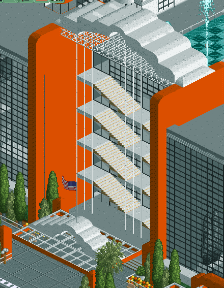
Staircase
A very unique feature of this hotel is its outdoor staircase. Things like this
are what make hotels great. An important part with all hotels that you make
is innovation, and rwadams did very well in making this area of the hotel.

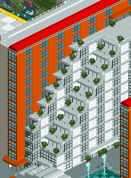
Balconies
One of the first things that you'll notice about this hotel is that it doesn't
have any balconies on the towers at all. In order to give the towers depth,
rwadams built into the pool deck with some smaller white buildings with the
stepping balconies. This gave the towers shape, and the stepping balconies gave
the white buildings a better design so that they don't look too plain
either. He also used foliage to break up the pure white of these inside buildings,
because without the bushes, it would be a much less interesting building.

Bridge
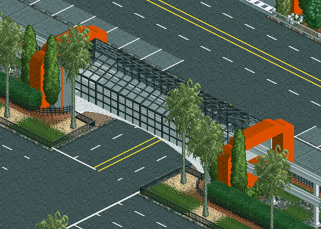
This screen is an example of the surroundings which give the hotel a much
better appearance. He doesn't just stop with the hotel, he created a transportation
hub to add to it. Also seen in this picture is the colors that he used are the
same as in the hotel and the monorail station. The colors made the bridge and
station seem to fit in and added a great feel to the area.
The Hilton, by rwadams (RCTspace VP Winner, Dec.
2004) (Back to top)
Click
Here to download South Beach Amusement Park by rwadams, member of RCT Masters

Overview, click for full size
There isn't much to say from the overview in this screen that won't be covered
by other screens, but I just wanted to show the overall appearance, landscaping,
and nearby things (like tennis courts, hot tub, pool) that he's included here.
One thing that should be noticed here is that the smaller entrances to the hotels
also have little decorations around them, instead of just plain doors.

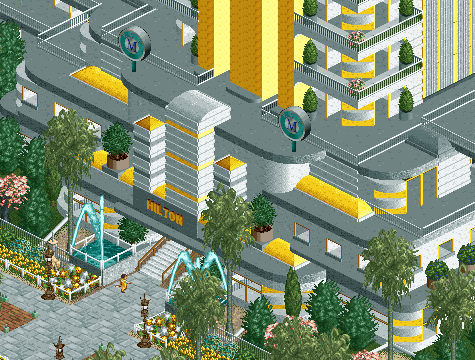
Entrance
The entrance facade is a very good example of fine detailing. He
gave every area texture by using the art deco pieces, and the glass
windows he used also make it appear a lot more interesting. This
is very good example of 1/4 tile work, and people looking to improve
in that area should definitly strive to do detailing this well.

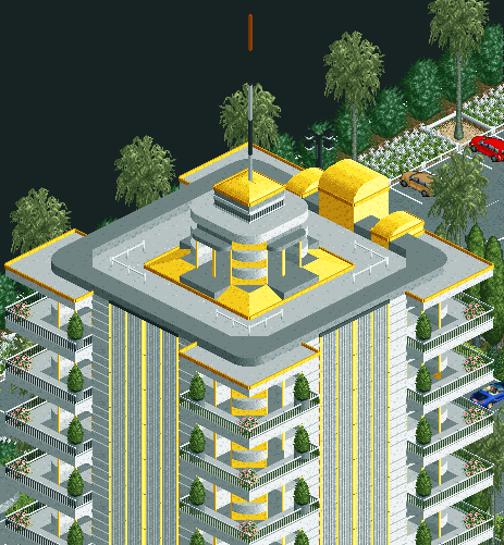
Top of Tower
The balconies in this area are very well done. The bushes on the
end and the flowers in the middle make it more interesting to look
at. They are coming out of the hotel 1/4 tile, which helps to add
depth to the tower. The observation deck is also a very original
idea, and very well executed.

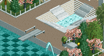
Hot Tub/Pool
The hot tubs (there's one on the other side of the pool) are pretty
cool to look at with the stairs leading down to the whitewater.
This was a good use of scenery that wasn't meant to be used in that
particular way, but it works out fitting perfectly. The diving board
is also a different approach than many others that have been around,
and the non-railing board makes it appear more like a springboard
than the usual platform diving board made by mini golf paths or
footpaths. He also adds great landscaping around the area, giving
it a more secluded appearance.
The Bellagio Hotel & Casino, by Emergo
(Back to top)
Download unavailable at this time

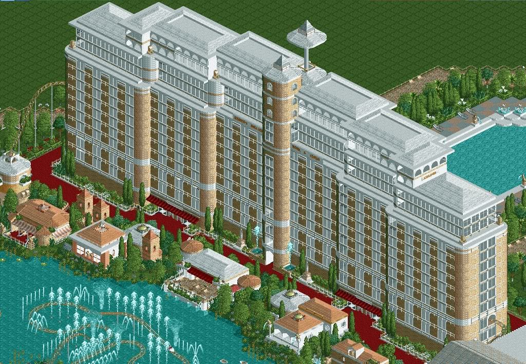
Overview from front
Click
image to enlarge
Just a note that Emergo wanted to point out, this is NOT a recreation
of the Bellagio Hotel & Casino, but a hotel based on the famous
resort. You'll notice the main difference being the missing 3rd
wing. This isn't to say that the hotel doesn't look great though.
In the above screen, you'll see the hotel with the most memorable
thing about Bellagio, the fountains. Not only does she create a
very nice looking formation, but also has a rollercoaster interacting
with them. You'll also notice that on the hotel side of the fountains,
there are plenty of shops, restaurants, and a beautiful viewing
area.

The Pool
Click
image to enlarge
The Bellagio hotel is known for it's high standards, and the pool
at Emergo's resort is no exception. The statues spitting water and
the fountains at the entry stairs not only show the luxury of Bellagio,
but also match with the color scheme of the hotel itself. Things
like this also add detail to a normally plain concept. The dense
trees around the pool also give a feeling of privacy, seclusion,
and exclusivity, all things that the real Bellagio strives to achieve.
Another thing to be noticed is the snack café/bar near the
pool. One thing to be noted in Vegas is that you're never further
than a 5 minute walk from a drink.

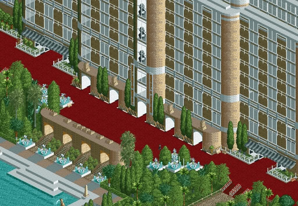
Poolside Entrance
Click
image to enlarge
In this screen you can see a few very nice features. First is the
arches entrance to the pool area with the fountains surrounding
it. Before I mention the next feature, something that would be nice
to know is that (as far as I can count) there are only 3 custom
scenery pieces. Even with this restriction on her, Emergo managed
to create realistic, detailed balconies and walls. The Bellagio
resort has balconies, but very small ones (as
seen here), and Emergo has done a nice job of creating the small
depth using the layering technique to make the railings seem further
out than the glass in each room. Each floor also has its own floor
lobby in the center of the hotel, and on the main floor there are
shops on either side of the entrance with well-used awnings and
floral arrangments.

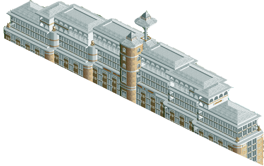
Roof (from front)
Click
image to enlarge
I show the roof of this resort to demonstrate a point. A lot of
hotel roofs are only one level. In this hotel, Emergo uses 4 different
levels, mirrored around the center in order to make it look more
appealing. She also included the conference rooms/observation deck
at the very top of the hotel. To top it off, an observation tower
ride was put in to make it more realistic for RCT peeps
Turistica, by Emergo (Back
to top)
Download unavailable at this time

Entrance to the Hotel
Click
image to enlarge
Here you'll see the entrance to Turistica Hotel. One cool thing
that Emergo did with this hotel to add realism was she added rides
to make it more functional. The example in this screen is the cars
driving up the driveway to a drop off area. This is just a little
touch that can be added by a simple hack to add a lot of appeal
to the area. On top of that you can see two well made custom fountains
and a stylish entrance staircase to the hotel.

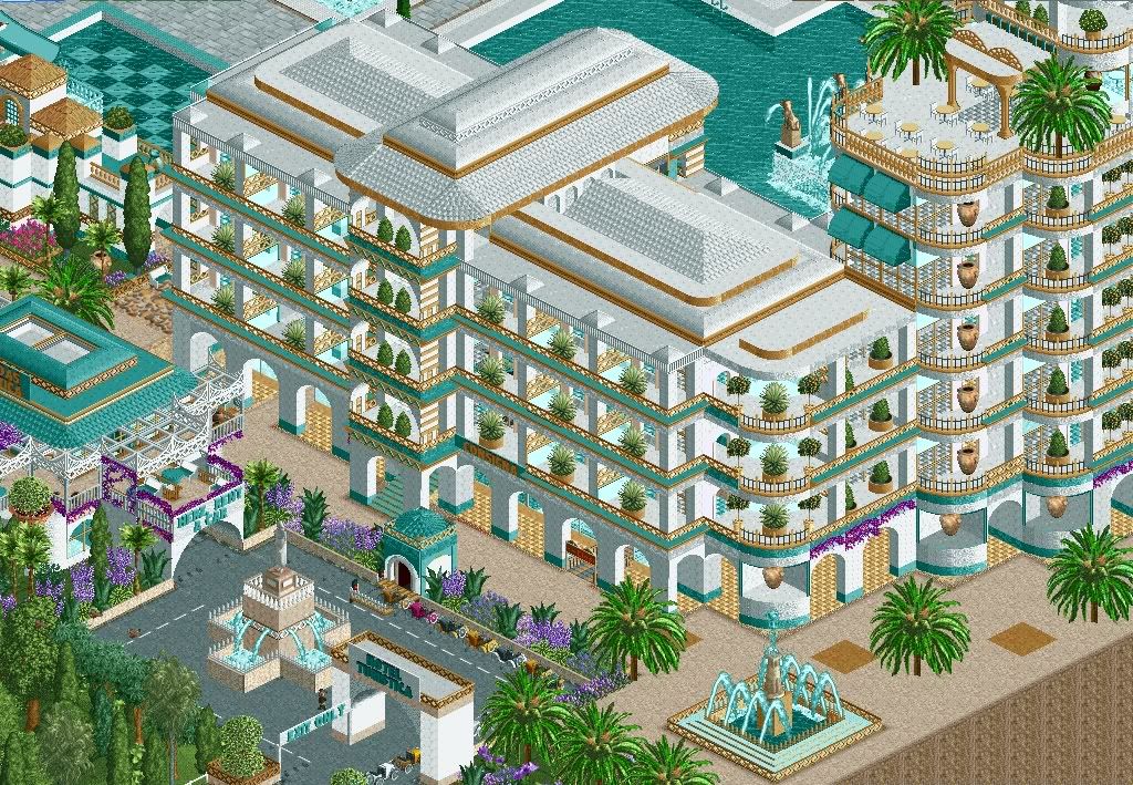
The main tower and a wing
Click
image to enlarge
In this image is one of the wings and the main tower of the hotel.
On the bottom floor you can see the balconies supported by simple,
but great looking arches. She used the teal bases and draped lilacs
to break up the otherwise all-white supports and make them more
appealing. You can also see in this screen that there is a variation
on the type of rooms in the hotel. On the side of the wing you can
see evenly sized normal rooms, with well-decorated balconies and
interesting dividers. As you move further left on the screen the
rooms start to get bigger with bigger balconies. On the main tower
there is an outdoor café on the roof making good use of the
columns and Victorian arches on the entrance. Above the café
are larger suites, with very big balconies that have a panoramic
view of the area.

The Pool Area
Click
image to enlarge
In the back of the hotel is the pool. Continuing her attention to
detail, there is another custom made fountain inside the pool for
swimmers to play around, deck chairs, ladders to get out of the
pool, and she even included the swimmers themselves. Also on the
building there are tall glass windows overlooking the pool (and
if you look inside, she's even decorated indoors).

Overview
Click
image to enlarge
That car ride as a driveway wasn't the only ride she included to
add realism and movement to her hotel. In the back you can see she
has used Amazing Earl's swimming pool ride as an attraction, and
a waterslide going into the pool. There are also people relaxing
in the oversized hot tub. You can also see in this screen her multi-leveled
roof to break up the blockiness (also used in her Bellagio hotel).
In this hotel, Emergo's attention to detail has made a good hotel
layout into a great hotel design.
A message to all viewers:
More hotels will hopefully be added soon. If you would like
to have yours reviewed and put on this page, make a post in the
hotel tutorial located here.
(Note: not all hotels will make it on this page. Only the
great ones will be put on this page as an example for others to
follow. Don't worry, I'll judge it fairly and have other input.
I'll try my best to review all of yours that you post in the topic
and help you improve it.)
A very special thanks to:
Xophe
X250
marinersfan59
RCTNorthWest
rwadams
Emergo
all scenery creators who's objects were used
all owners of images used for reference
All images were used with express written consent by their creators.
Page made for the RCTspace Tutorial Team located at the RCTspace
forums.
|

